Pitch decks are a necessary evil.
I should know—we've reviewed over 20,000 pitch decks over the past 4 years at OpenVC. We also spent countless hours constructing one of the largest databases of pitch deck slides, OpenDeck.
Based on these experiences, we've built this tutorial to help you build the perfect pitch deck. Grab your laptop, secure a few hours, and follow the process step by step.
Ready? Let's do it!
Table of Contents
0. What is a startup pitch deck?
A pitch deck is a short presentation optimized for clarity and impact. It can be emailed to a an investor who reads it, or it can be "pitched" i.e. presented in person.
As such, the pitch deck is a key document when raising funds.
The pitch deck is usually created by the founder(s) of the company. A designer or consultant may help with it, but ultimately, the CEO is the one who owns and pitches the deck.
A typical pitch deck follows a well-established structure: cover, problem, solution, product, traction, business model, market, go-to-market, team, the ask, back cover. Here's an example of a great pitch deck.
At first sights, building a deck seems simple. The truth, however, is that getting to a top 1% deck will take hours of work and weeks of iteration.
Here's how to get it right the first time.
Get free, instant pitch deck feedback 
Catch the issues investors would reject in seconds — before you hit send.
1. Nail your pitch deck slide by slide
Derived from our Fundraising Masterclass, the next section breaks down what gets investors on the edge of their seat, slide-by-slide.
1.1 Cover slide
The cover slide is your first impression. It's strategic real estate. Treat it as such.
First, write your startup name in BIG. Bind got it right.

Second, use a descriptive tagline.
You are probably familiar with the inspirational taglines used by big brands such as "Come as you are" (Mac Donald's) or "Just do it" (Nike). That's not what you need. You're an early-stage startup.
Early-stage startups use descriptive taglines:
- Coinbase (pre-seed): "Your hosted bitcoin wallet"
- AirBnB (pre-seed): "Book rooms with locals"
Your taglines should say in clear, simple words what you do. It's even more important for investors since this tagline will help them assess whether you're a good fit or not.
Third, add an illustration that showcases your product or your users. Something clean and neat, not a dirty screenshot please.
🥋 Pro tip: DO NOT include any date on your cover. You don't want investors to know when you started raising. This is a massive mistake I see founders do everyday. If you think I'm exaggerating, read this.
1.2 The Hook
The hook is a broad statement that gets the investor on board. It sets the stage for your story and catches the investor's attention.
A great hook is the "Why now", where you explain why your startup needs to exist now, and could not have happened before. It's a powerful slide because timing is everything when it comes to innovation.
Use a "why now" if your problem can be traced down to a clear legal, technological, or market shift, that explains why it exists in the first place:
- Weed has just been legalized = > Weed delivery opportunity
- People have high-speed internet + smartphone cameras => Youtube opportunity
However, many founders cannot articulate a powerful reason "why now", and the slide ends up weak and unconvincing.
If you don't have a strong hook, just skip this slide entirely.
1.3 Problem slide
The Problem slide describes the "problem" your startup is solving.
You want your problem to be undeniable. Investors should read your slide and immediately understand and agree with your problem statement.
To make your problem undeniable , you have to make it specific.
- Specific customer : If you're building a CRM software, you can serve dozens of different customer types, from solopreneurs to Fortune 500 companies. But can you be the best for everyone? No. So pick your target customer (by geography, revenue, industry, etc) and frame your problem around them.
- Specific problem : If you're building a CRM software, you certainly solve dozens of micro-problems, from team collaboration to data enrichment and workflow automation. But are you the best for every case? No. So pick a specific problem where you can be 10x better than everyone else and frame your problem around it.
- Painful problem for the target customer: The specific problem applied to the specific customer should be as painful as possible. Just focus on the #1 most painful problem for your target customer and ignore all the secondary ones.
Yes, your product can solve more stuff for more people down the road. For now, you are small and you want to show focus and dedication.
Let's take another example. If you say "Flying sucks", that's too generic - maybe big VC travels first class, and it's actually pretty sweet. So undeniability comes down to being specific enough. Say "Flying economy sucks" and everyone will agree with you.
Now, who is it most painful for? Probaby long-haul travelers and family with toddlers. Now say "Long-distance flights are a pain for families with toddlers" and you have yourself an undeniable problem to solve!
Bonus point if you can quantify the problem. It's not always possible, but if you can put a number (X% margin lost, Y hours of productivity lost), you're making it much easier to put a $ amount on it down the road.
In terms of layout, keep it simple.
Either go with one big bold statement and a large illustration, as such:
Or go with the classic three-items panel like so:
🥋 Pro tip: Sometimes, there's no "problem" to solve. You're just seizing an opportunity. That's fine, just call it "Opportunity slide" and move on.
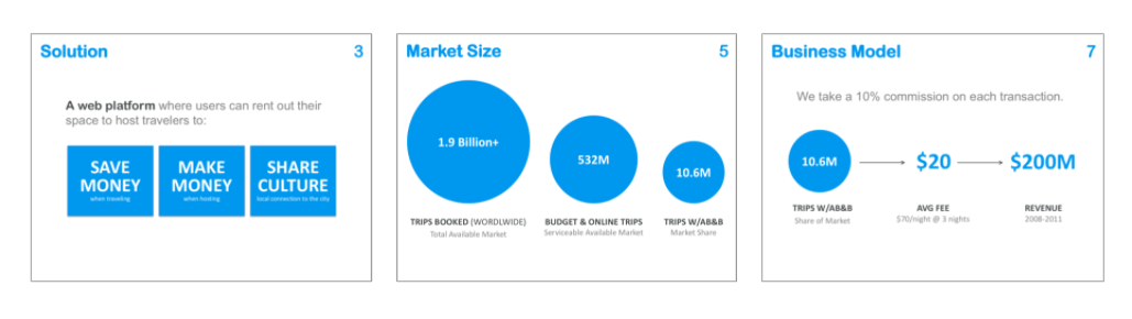
1.4 Solution slide
The solution slide explains how you solve the problem for the users.
Obviously, the solution slide should answer the problems raised in the Problem slide.
It can be presented as a bold statement, as shown below.
It can also be presented as a classic table with three items.
The Solution slide typically focuses on the "value" of "benefits" for the customer as opposed to the "features".
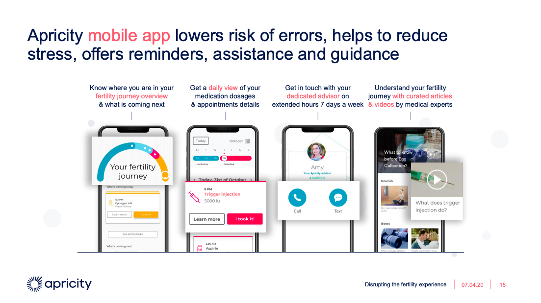
1.5 Product slide
The product slide explains how your product works.
For vanilla software startups, the product slide includes pretty screenshots. It describes the user flow "how it works" or highlights the killer features.
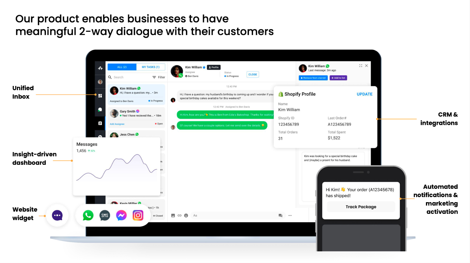
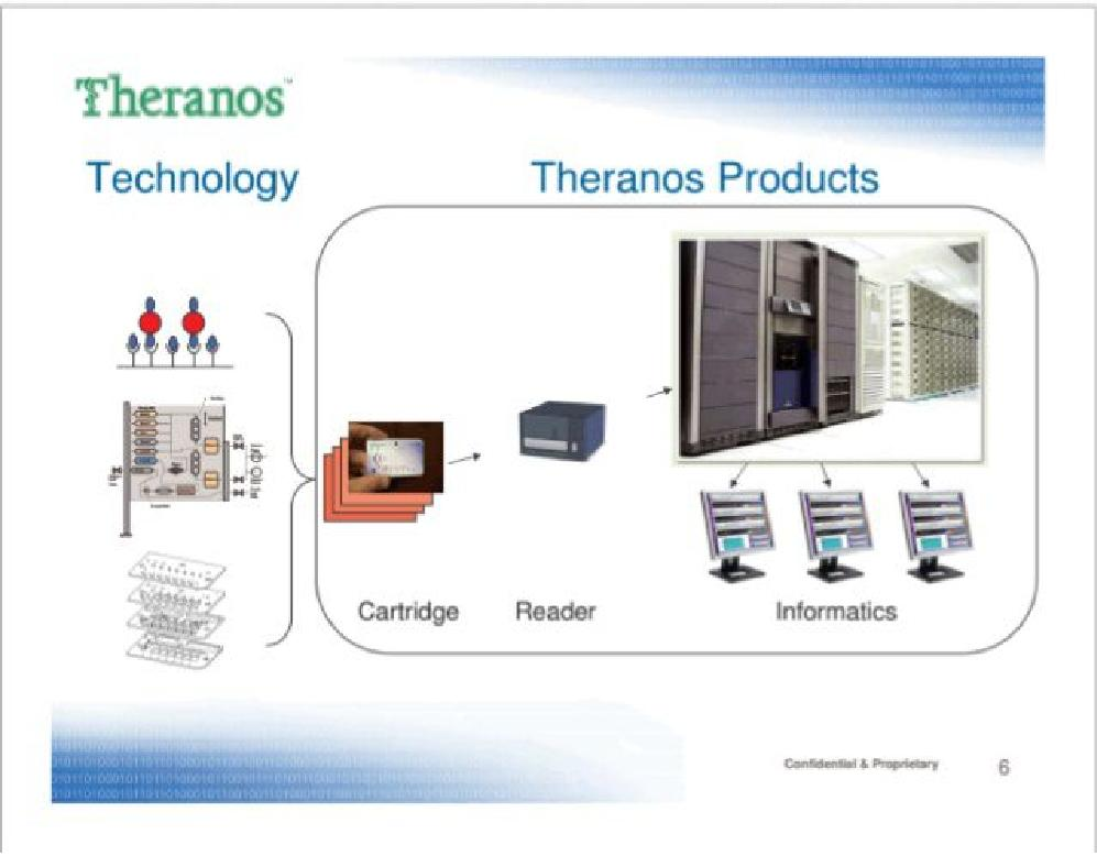
For deeptech or hardware products, the product slide should give you credibility. This is where you can lift the veil on the secret sauce AKA the "reason to believe".
🥋 Pro tip: Sometimes, the Product slide is redundant with the Solution slide, so you can just "merge" them by showing both the key features and the value they create. If you can, do it and save 1 slide.
1.6 Traction slide
The Traction slide shows investors that your startup is not just an idea, but a reality. It's a major part of "derisking" their investment.
First, you need to show the right metrics. Every business model has typical metrics that investors want to see: ARR for SaaS, GMV for marketplaces, GTV for paytech, DAU for social media, etc. Do your homework and make sure you know what the North Star in your space is.
Second, make sure to avoid vanity metrics. Vanity metrics are metrics that may seem impressive but don't actually give any meaningful information abouy market validation. For example, a SaaS startup should not show sign ups just like a mobile app should not show downloads. Instead, focus on the Balfour's trifecta of PMF: non-trivial top-line growth, retention, and meaningful usage.
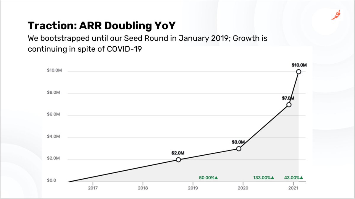
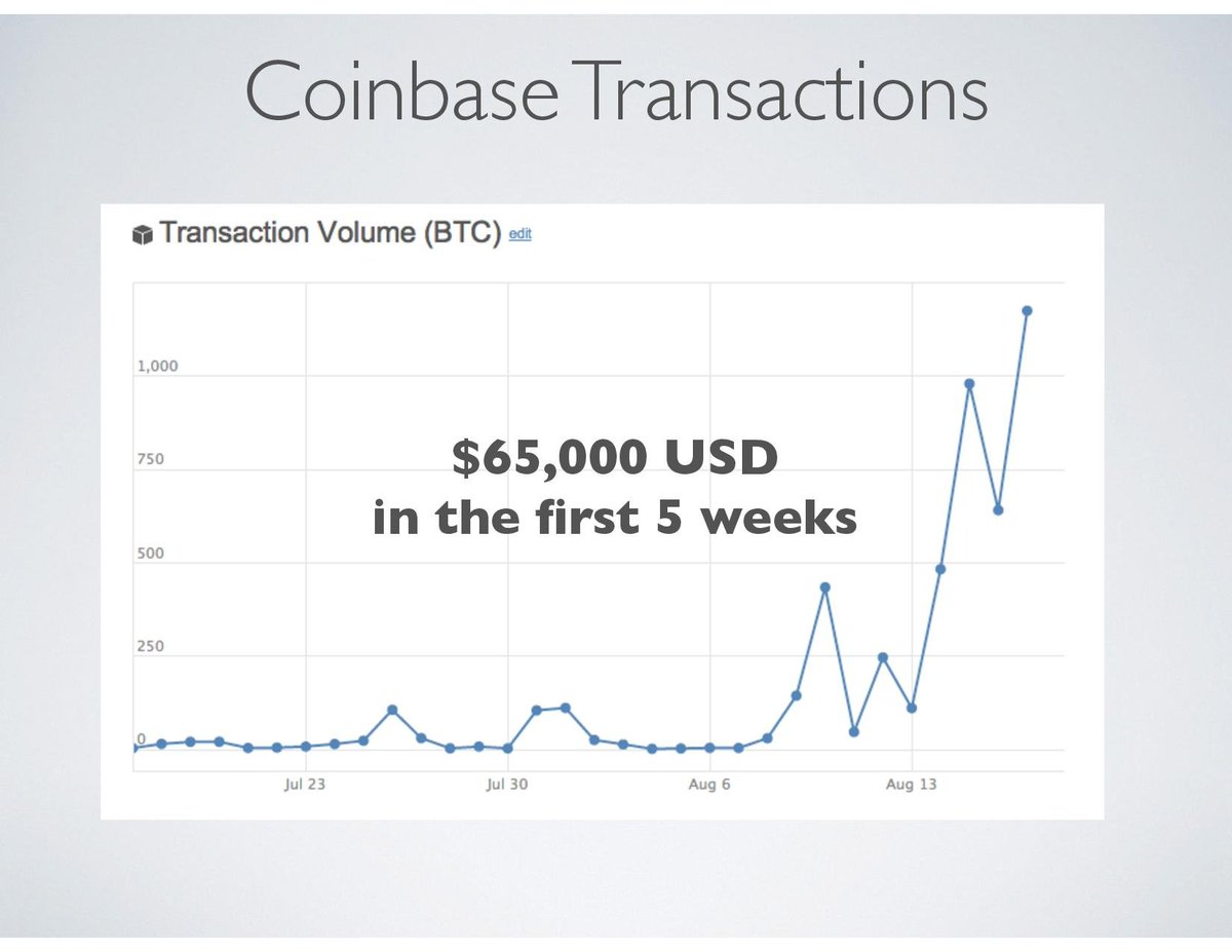
Third, don't fool with the X-axis. Let's say your MRR went from $10 in May to $100 in June. Nice. But please, don't tout 1,000% growth MoM. This kind of claim is naive at best, dishonest at worst - and an absolute trust killer.
If you're just getting started, be transparent about it, like Coinbase did:
Watch out for "false" traction:
- An MVP is not traction. A product means that you know how to build - and it's great. But it doesn't mean people actually want your product.
- Testimonials are weak overall. Founders often get testimonials from friends, ex-colleagues, etc. Investors know that, so they give little credit to testimonials, unless it comes from a respected figure of authority.
- Competitor's numbers may serve as a form of market validation. But of course, they say nothing about your own traction. So don't lean too much on that either.
🥋 Pro-tip: If you have no/low traction, there are 3 options left.
- The "Marc Lore" : With a proven track record, traction doesn't matter. See Marc Lore, who raised $350M pre-launch for Jet․com.
- The "Russ Hanneman". With the right market circumstances, you could sell a story à la Hanneman. Don't take it from me, take it from the king: https://youtu.be/BzAdXyPYKQo.
- Raise later. Founders don't like to hear it, but if you're too early, just bootstrap longer. This goes back to the very first point of this post about fundability. Take this online test to see how fundable you are: http://fundability.app.
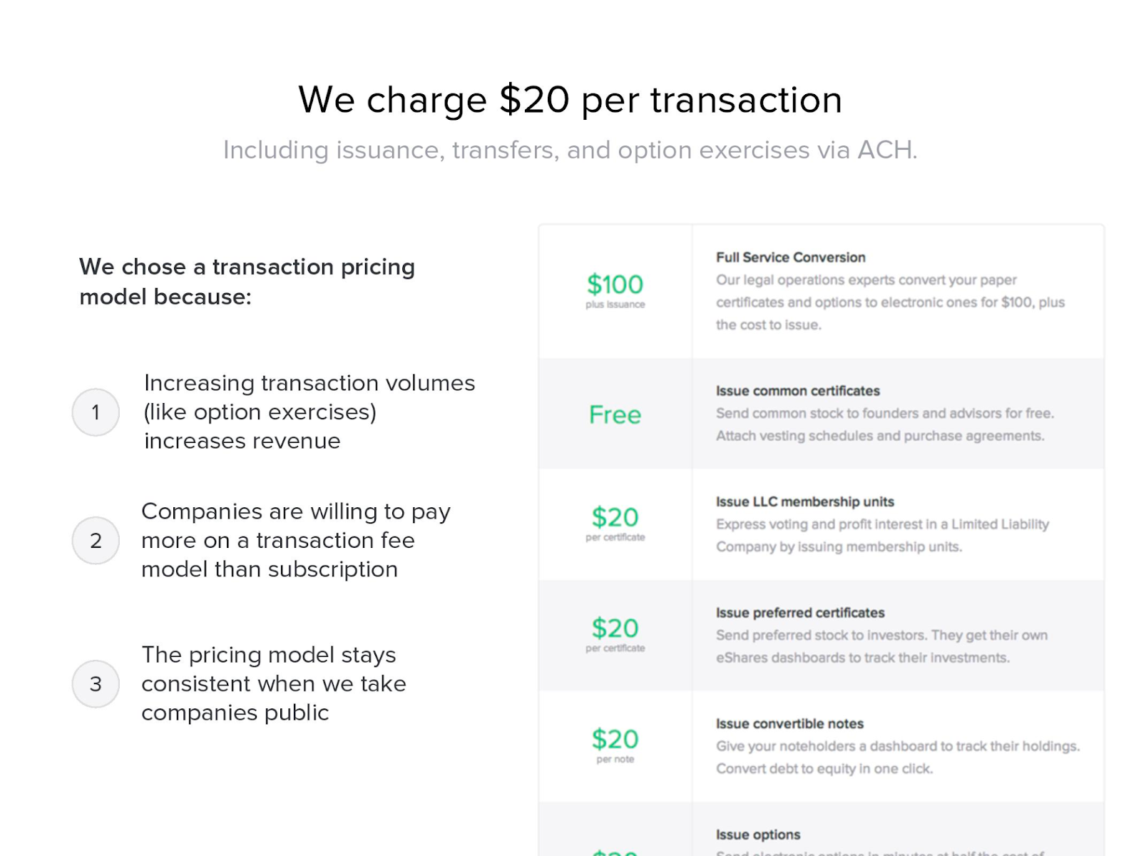
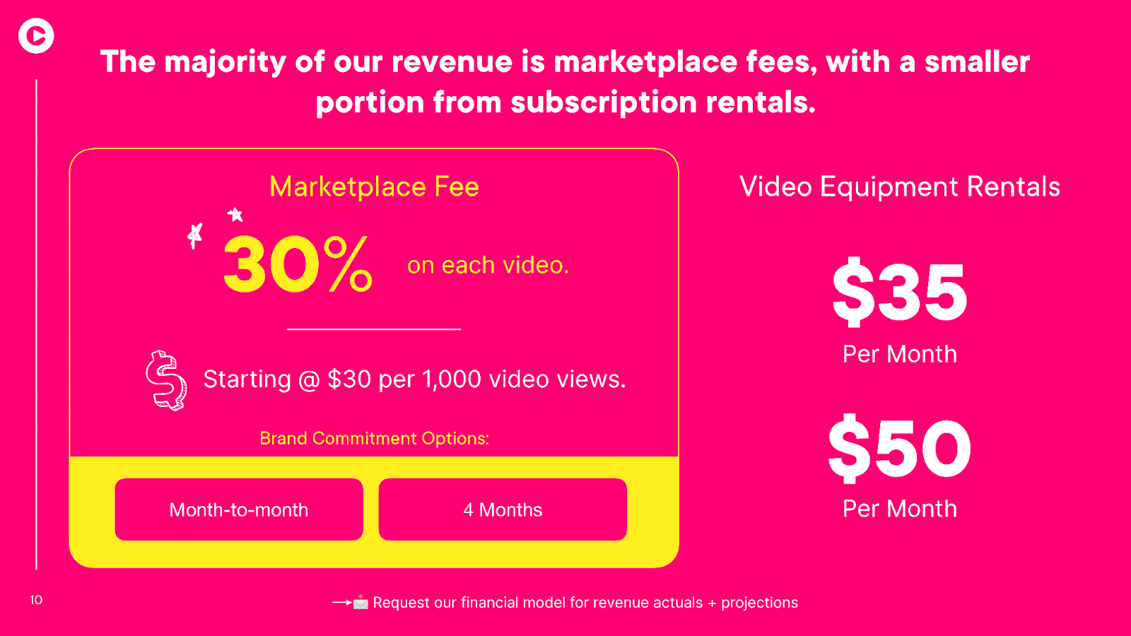
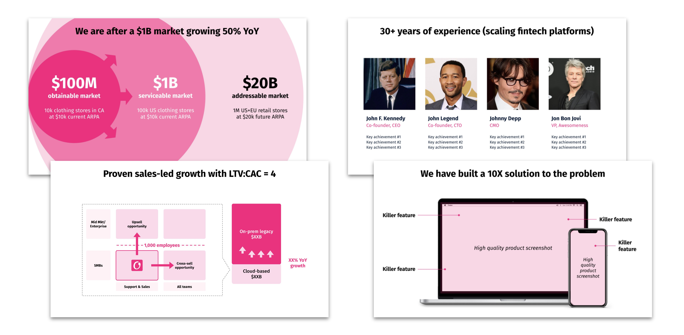
1.7 Business model slide
The business model slide shows investors how you make money - or plan to.
Here's what you should include in that slide:
- How much you make per customer AKA your ARPA
- Your economic model: subscription, transaction, etc.
- When it's not obvious, explain why this model is the right model
- If you do true enterprise, include the ratio of service revenue VS software revenue
- If you do hardware, your gross margin
- You can also highlight potential for upsell/cross-sell if relevant
This slide is pretty straighforward and easy to do. Keep it simple.
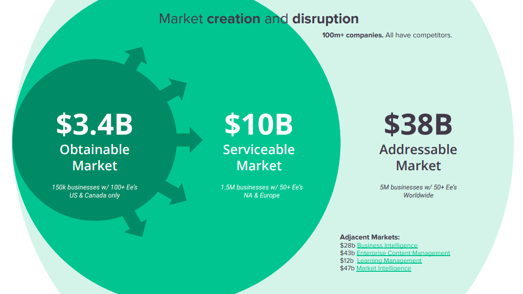
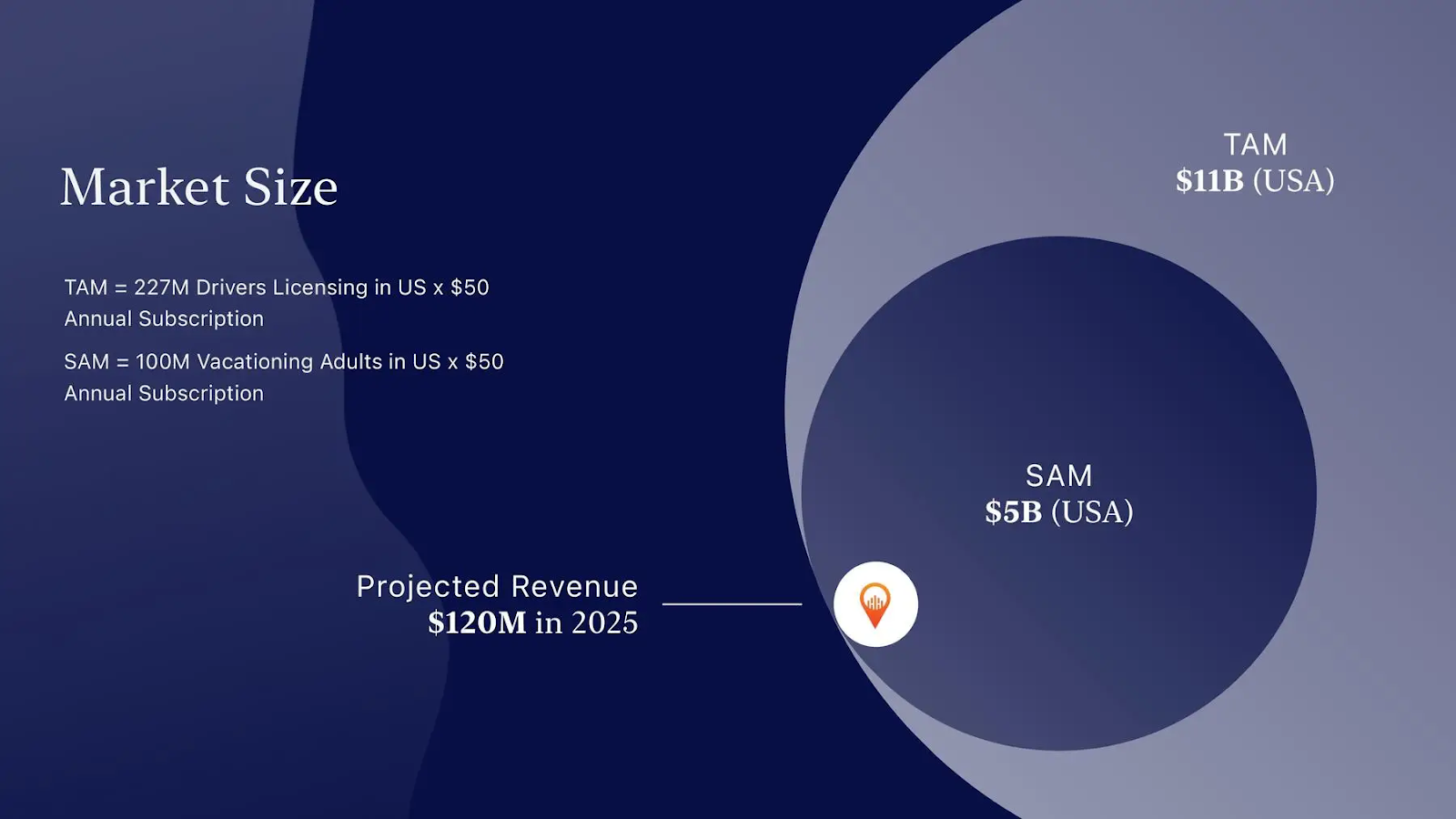
1.8 Market slide
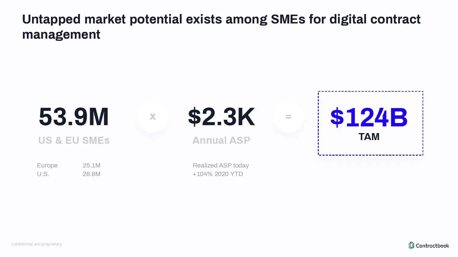
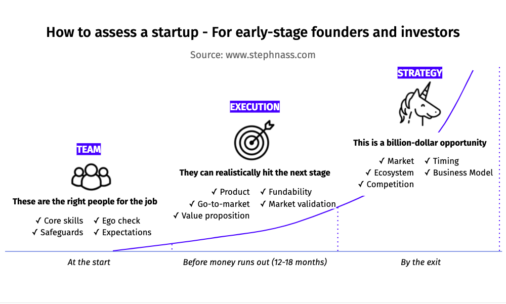
Your market slide needs to show two things: One, that your market is large enough to build a billion-dollar business. Two, that you have a sophisticated understanding of your market beyond rough numbers.
Let's see how you do that.
You probably heard of TAM/SAM/SOM. This is a classic way of breaking down market size and was made popular by the (in)famous Airbnb deck.
- Express your market size in $ value, not in number of users or other
- Do a bottom-up market sizing, not a top-down market sizing.
- Your market slide should include your TAM, SAM, and SOM
- Your SAM should be above $1B
- Include the market growth if it's significant eg 20%+ CAGR. Otherwise, don't include it.
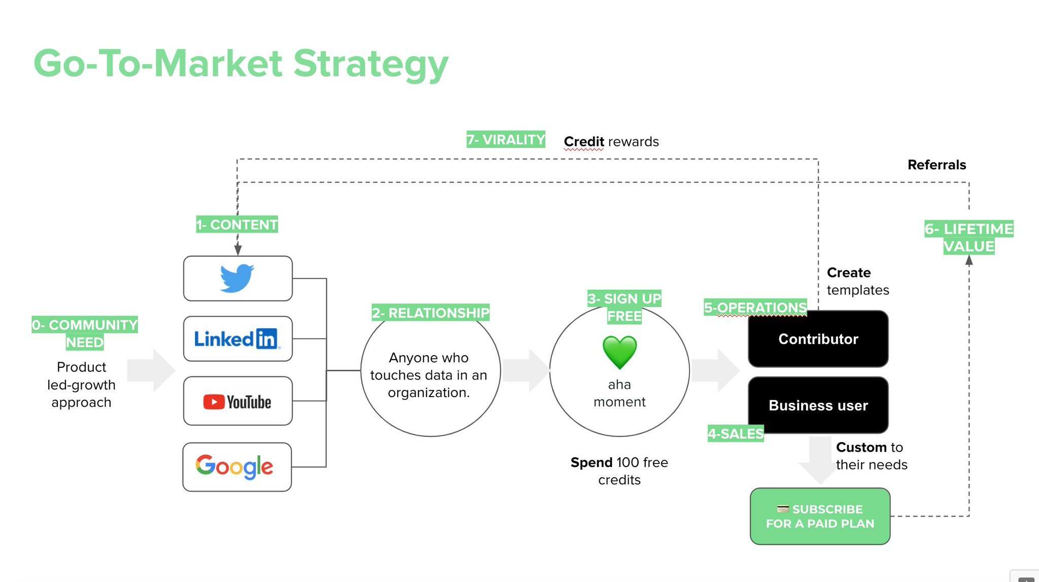
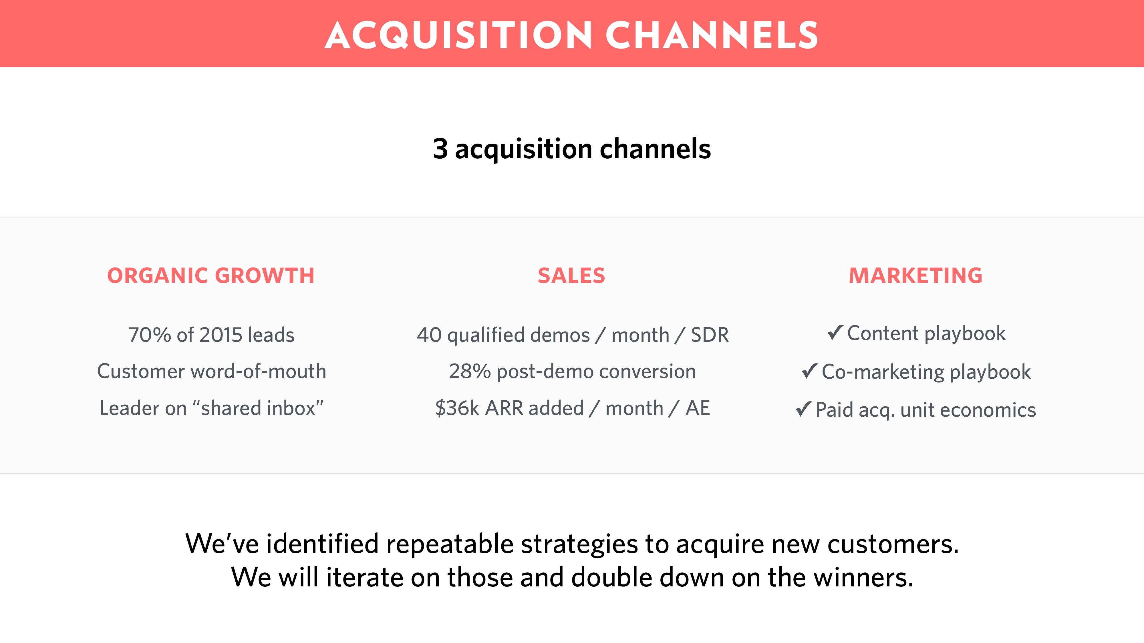
1.9 Go-to-market (GTM) slide
This is the hardest slide by far.
Most GTM slides are terrible, because they are just a list of intentions: "We will do Google Ads, influencer marketing, and social media stuff".
Instead, here's what you should do:
- Show a process that brings together channels and actions in one tight flow
- Don't just talk about intentions, but also mention past achievements
- Include numbers - CAC, LTV... A GTM slide with no numbers is unacceptable.
Your GTM must be consistent with two other aspects of your business:
- Your business model. There is a strong correlation between your pricing point and your GTM. Therefore, investors will look for inconsistencies between how much you sell (your ARPA) and how you intend to sell (channels, CAC, etc). If you didn't know, you MUST read this post by Chris Janz).
- Your team. If you plan to do sales-led growth but your whole team is made up of developers, that's a red flag.
I couldn't find any perfect GTM slide to illustrate this section. If you have one, send it to me and I will give you a full year of OpenVC Premium for free.
Meanwhile, here are some interesting GTM slide for inspiration.
🥋 Pro tip:For vanilla software (dating apps, productivity tools...), distribution matters more than product. If that's your case, make sure to give your GTM slide as much love and attention as your Product slide. Most first-time founders just don't get that point.
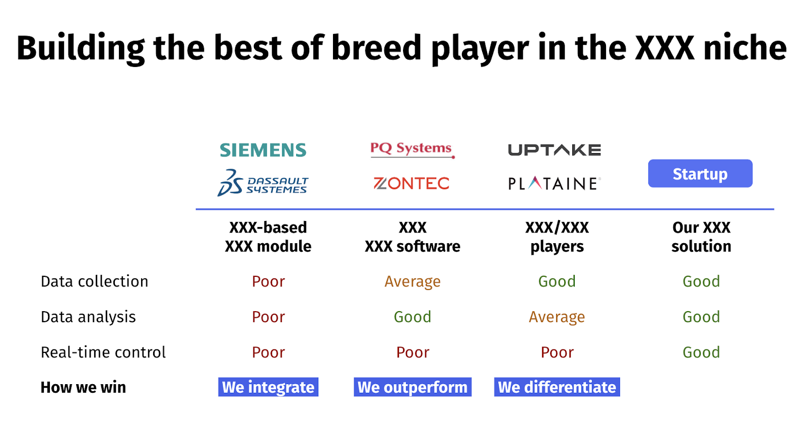
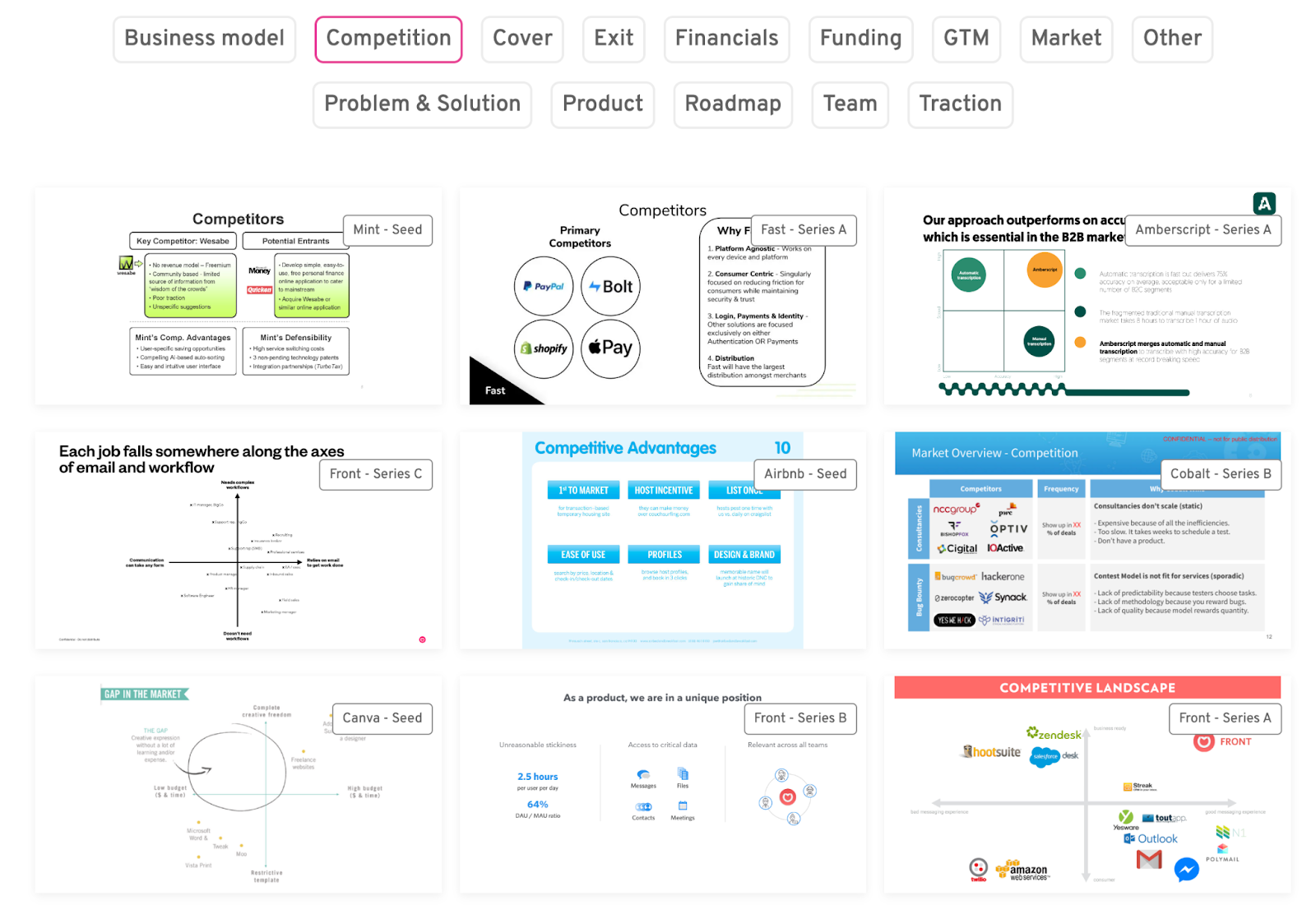
1.10 Competition slide
Most Competition slides are incredibly weak.
Typically, this is the Competition slide you build:
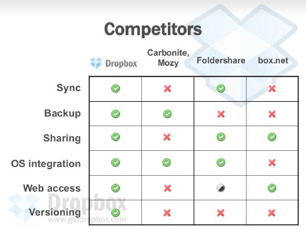
This is what investors see:

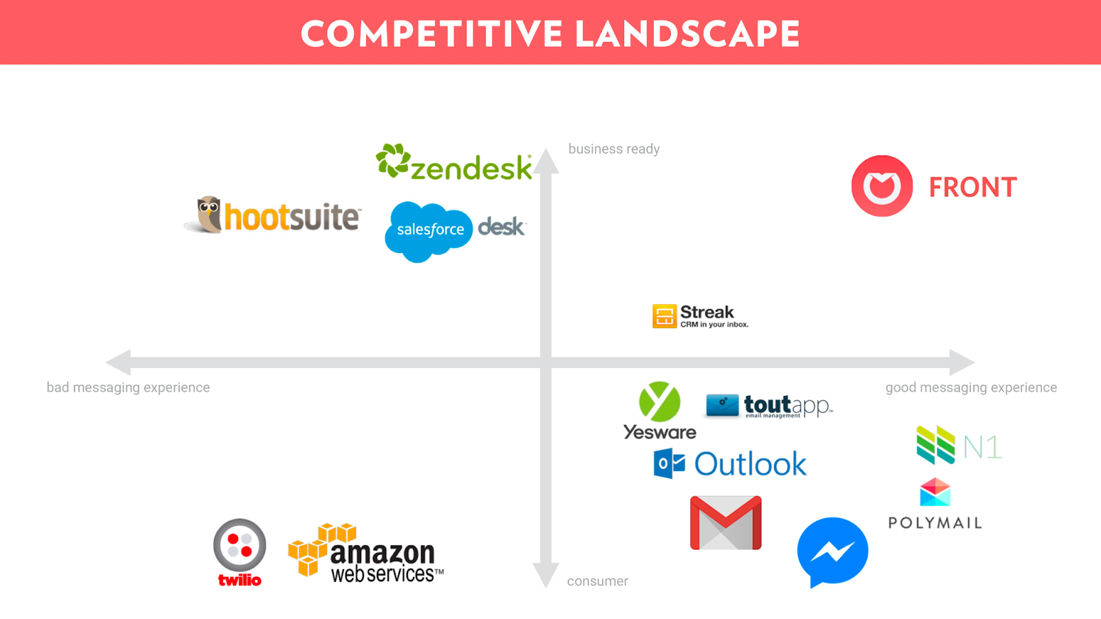
The same goes for the infamous "quadrant" slide, where your startup always ends up in the top right, because of course.
These slides are not bad "per se", but they have been repeated so poorly so often that investors have grown desensitized to them. Besides,So what can you do:
- Drop the feature list entirely. You should have it in your Appendix - it's part of your homework. But don't claim features as your key differentiator. It makes you look like a naive founder who believes that more features = more success.
- Group competitors and features in high-level categories. This shows a finer understanding of your space and allows you to show off your industry expertise.
- Say clearly how you are better/different. Just showing a table or a quadrant is not enough. You need to explicitly say "why" you are better or different. Don't let investors guess, tell them in no uncertain terms.
Here are a few examples of interesting slide designs.
The slide below shows a solution that unbundles a niche feature from a typically large suite of software.
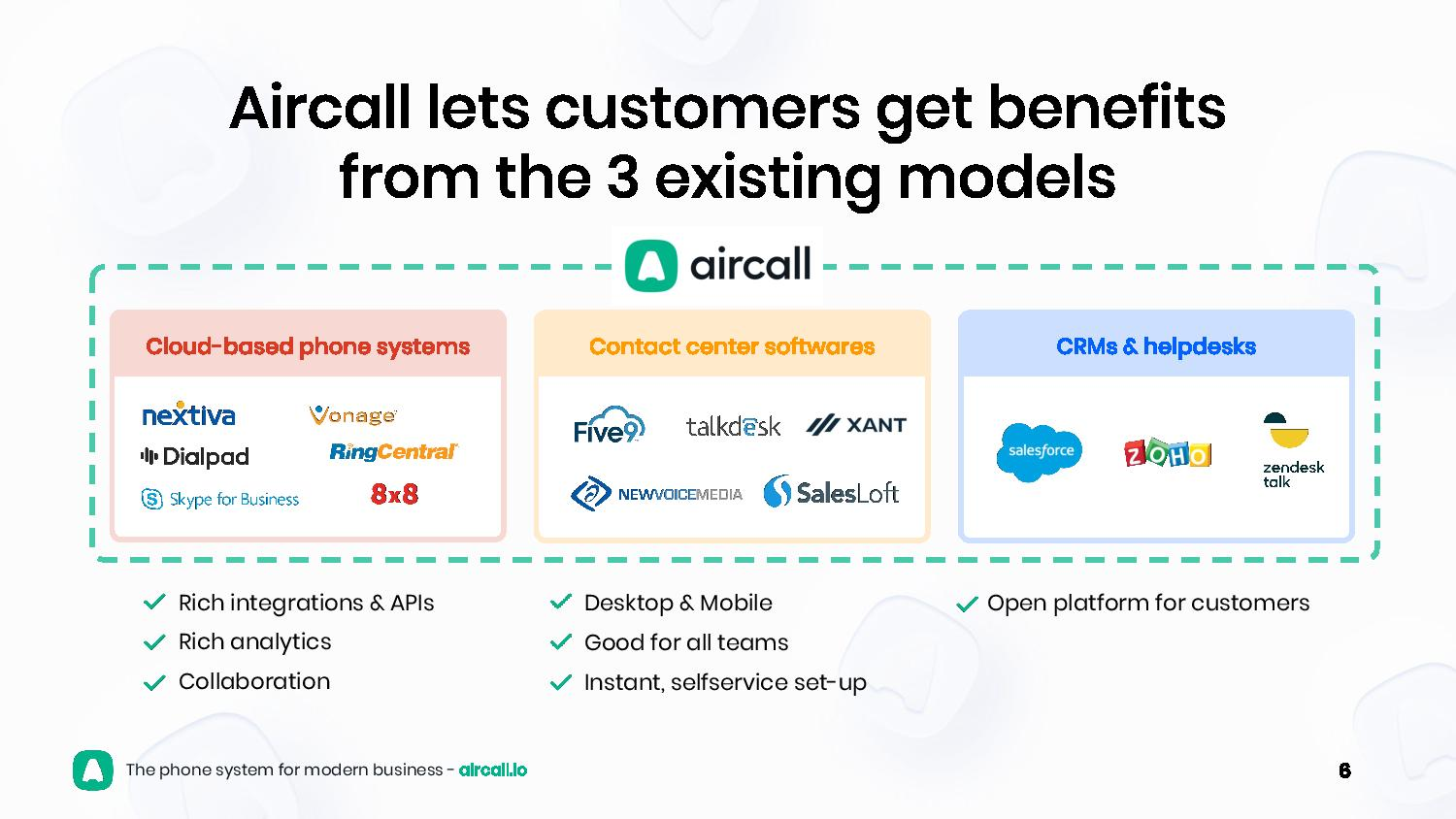
Here's another example that shows the opposite: Aircall "bundles" several solutions into one. By the way, you should absolutely read the whole Aircall deck - it's a masterclass.
🥋 Pro tip: Don't say that "there's no competitor", because it's never true. For most software, Excel is a massive competitor, when it's not simply paper & pen. In any case the status quo is always your competitor.
1.11 Team slide
The Team slide is easy, but people often get it wrong.
First, you want to write a killer action title. Your title should capture the team-market fit in 1 clear sentence. Make it specific, not generic:
- Bad: "Team".
- Average: "Our team has experience & passion"
- Good: "30+ years scaling B2B marketplaces at Uber and Airbnb"
See below - title is too long, but good otherwise:

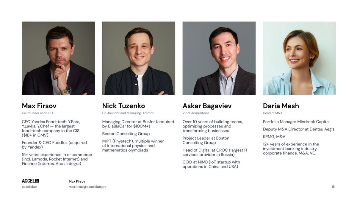
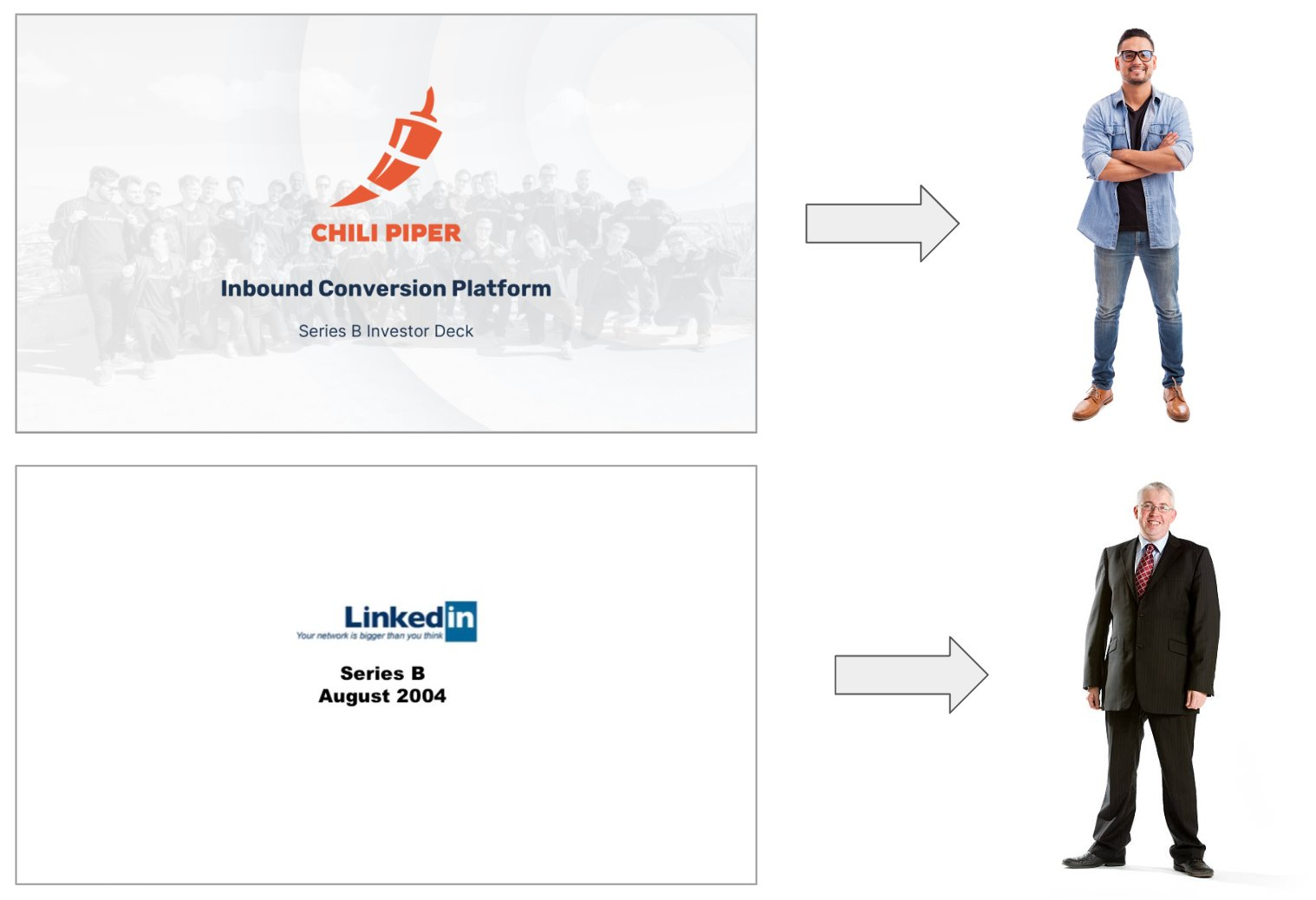
Second, include the right people + information. Every key executive should be listed. No advisor, no investor, no consultant.
For each key executive, your slide should include:
- A professional, color photo (no NFT!)
- Full name and title
- Clearly mention who the CEO is and who the co-founders are
- 1-3 key achievements, specific & with numbers when possible
Here's a great example:
1.12 Funding slide
Just like the Team slide, the Funding slide (or Ask slide) is very easy to build.
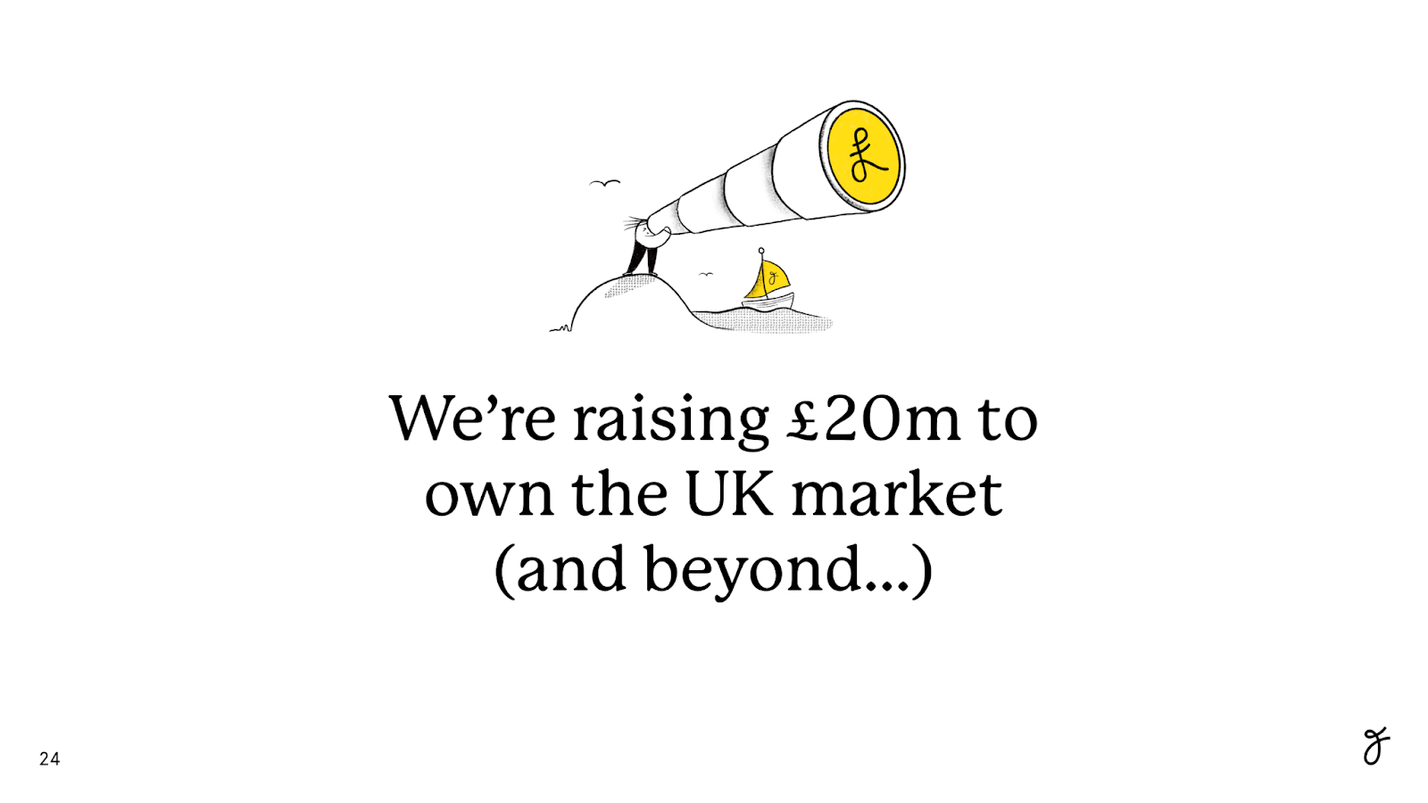
Here's what you must show on your funding slide:
- Round size e.g. "We're raising $1M".
- Objectives e.g. "We're raising $1M to get to $5M ARR"
- % of round committed (if applicable) e.g. "$600k already secured with strategic angels"
What you may also include (optional):
- The identity of your committed investors, especially if they're high-profile
- Financial instrument: SAFE, convertible notes, priced round
- Funding history i.e. the previous rounds and investors
- Use of proceeds i.e. how you will spend that money (hire engineers, spend on ads…)
- Funding terms i.e. valuation, cap, discount, etc.
- How long the money will last you (should be 18 to 24 months)
That's it! That's the slide.
Also, a reminder that "fundings committed" means you either have a term sheet (for a priced round) or you have money in the bank (for notes). A verbal agreement is NOT a commitment.
Here's a very simple version of that slide, but it works.
Here's another version showing committed investors and funding history on top of the mandatory stuff.
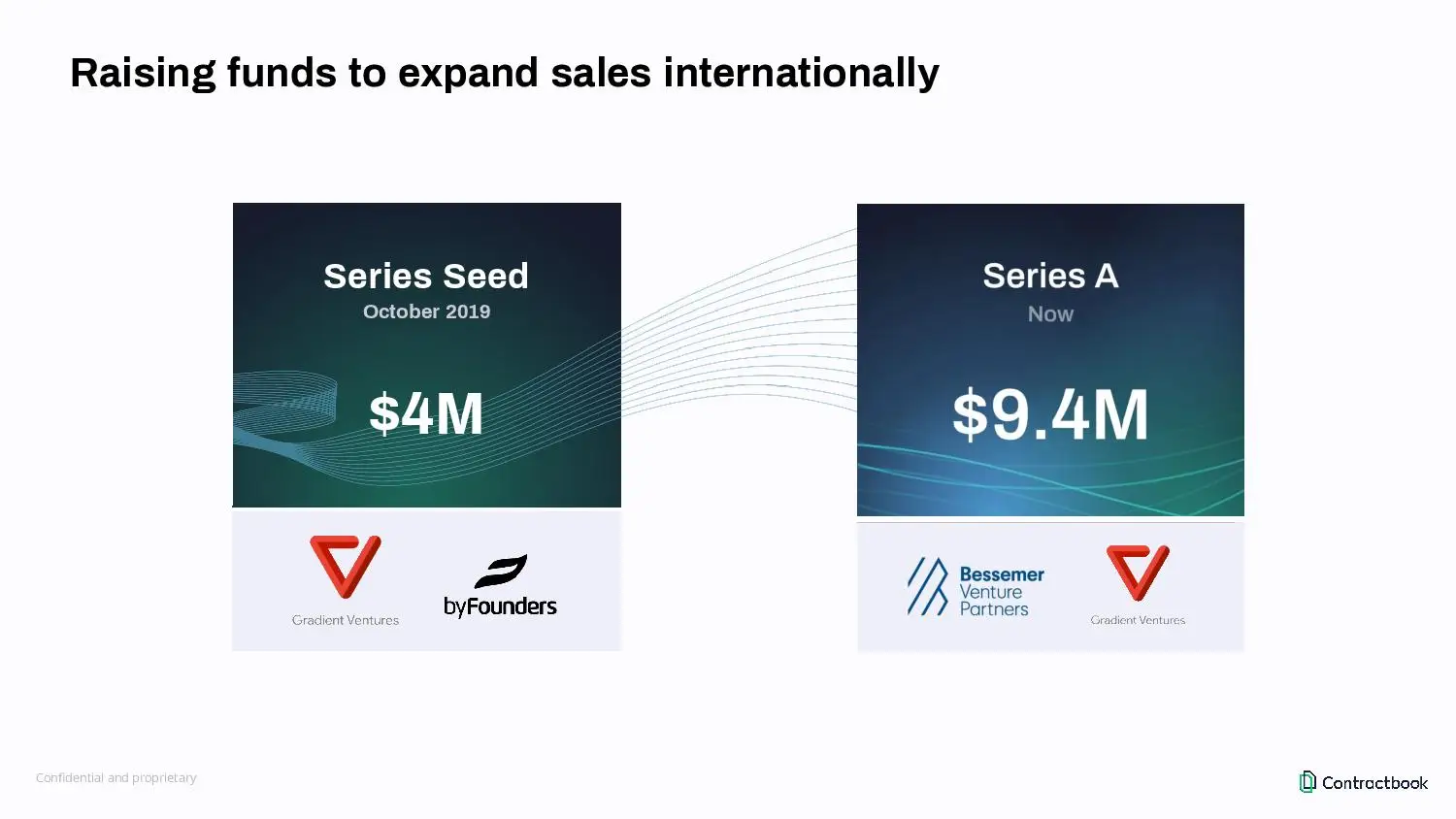
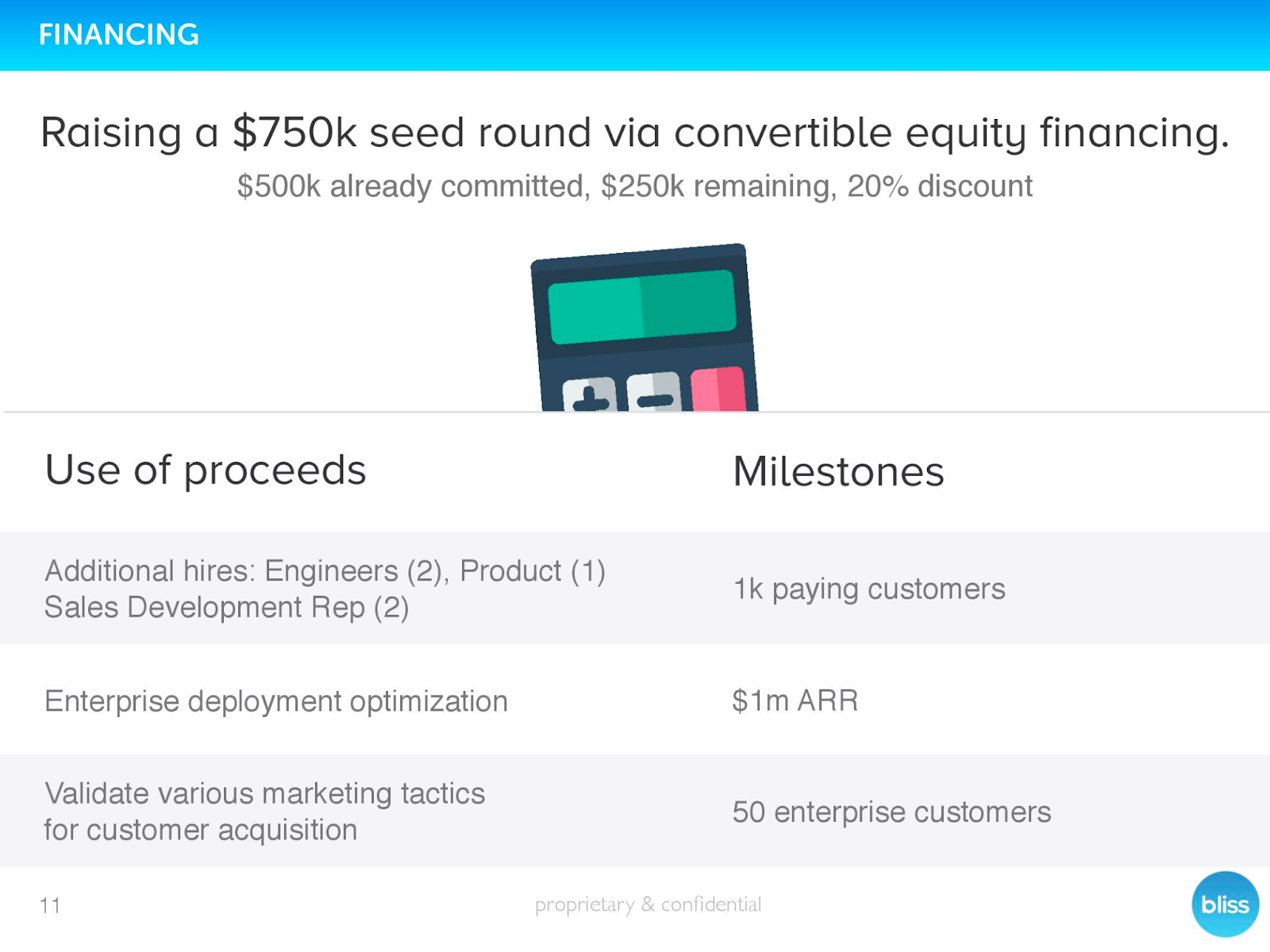
And finally, here's a version showing the use of proceeds and terms on top of the rest. It's almost too heavy if you want my honest opinion.
1.13 Back cover slide
The back cover has only one role: it's a call-to-action.
If investors like your deck, they should find your email address on the last slide so they can easily contact you.
The only rule regarding the back cover: I want to see the email address of the CEO.
Not "[email protected]". Not "[email protected]". Not "[email protected]".
I want the email address of the CEO.
And please, get a professional email address, not a Gmail one.
See two great examples below. Easy, right?

Get free, instant pitch deck feedback
Catch the issues investors would reject in seconds — before you hit send.
2. Prepare before building your pitch deck
2.1 Make sure you are VC fundable
Before building your pitch deck, make sure you are actually VC fundable.
Not all businesses are fit for VC funding. You need to have:
- A scalable, capital-efficient model
- A large addressable market
- An VC-friendly legal entity
- An investable cap table
- Enough IP ownership (if relevant)
- Positive signal: track record, traction, etc
For more details on VC fundability, read the post here.
You're fundable? Great, let's move on!
2.2 Pick the right slide editor (recommended: Google Slides)
The slide editor is the software you will use to build your deck.
There are three main categories:
As long as the presentation can be downloaded in PDF, you're good to go.
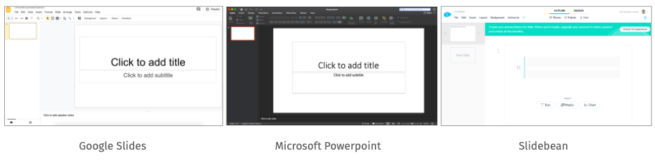
I've tried them all. My personal preference goes to Google Slides. It is simple yet powerful, user-friendly and has a large user base which makes it convenient to collaborate. It's also compatible with most pitch deck templates.
For the rest of this tutorial, I will assume you're building with Google Slides.
2.3 Pick the right pitch deck template (recommended: OpenVC)
Once you have your slide editor, pick a template. A good template will save you loads time. It also gives your deck a professional "look and feel''.
I have benchmarked the most popular pitch deck templates (see here ) and I recommend our own Ultimate Pitch Deck Template. It costs $99 (which includes all of OpenVC Premium as well) and is probably the best template available for early-stage startups.
Note that templates are usually compatible with Powerpoint, Keynote, and Google Slides, and not with other editors.
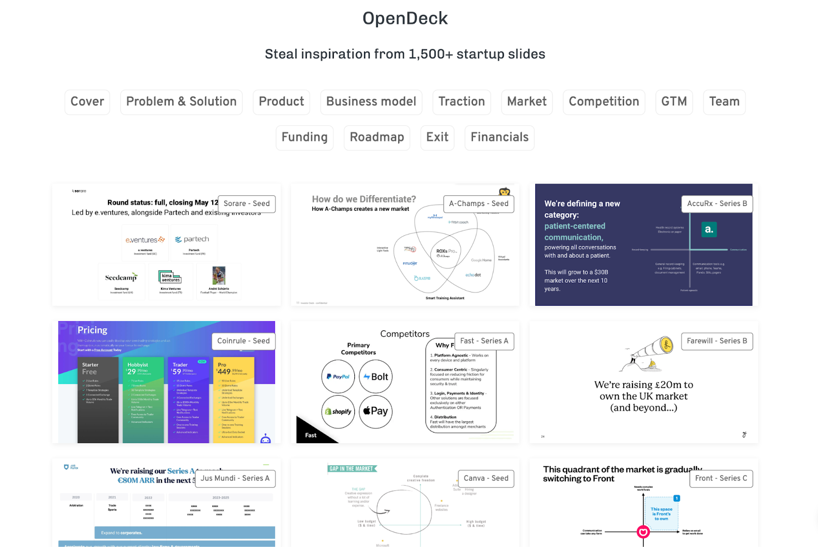
2.4. Steal some inspiration (recommended: OpenDeck.app)
Before starting your own deck, spend 20 minutes browsing through great slides to get some inspiration.
Go to OpenDeck.app (it's free) and browse some examples of great slides.
2.5 Lay down the key points of your pitch
Now, open this link and fill the template - make a copy first so you can edit it and save it.
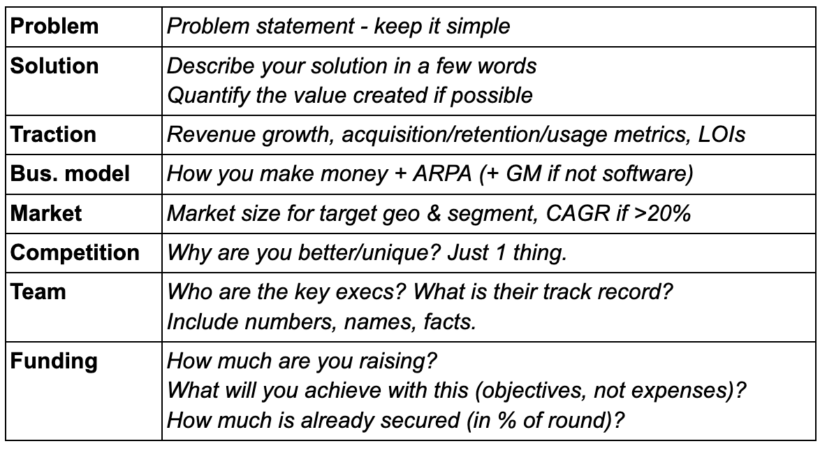
For each section, you will write down the key points. Fact-based, no bullshit, and include numbers.
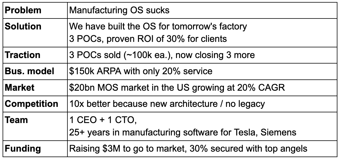
The end results looks something like this:
This is a critical part of the process. Spend as much time as needed on this.
Done? Perfect, let's continue.
2.6 Structure your main deck
Now open Google Slides.
Create 13 empty slides. These 13 slides will be your "main deck":
- Cover
- The Hook (optional)
- Problem
- Solution
- Traction
- Business model
- Market
- Competition
- Team
- Go to market
- Team
- Funding
- Back cover
Your main deck doesn't need to be longer than 13 slides. This is the deck you will send for a first contact, in your cold outreach or when getting an introduction. We want it short and to the point.
Later on, you will have another deck, much bigger, where you will include appendix slides. This bigger deck may be used to follow up after a successful first meeting, and include information like:
For now, I insist: your glorious product roadmap and masterful 5-year financials will be just fine in the Appendix. Keep it simple.
🥋 Pro tip: Founders sometimes ask "What's the right order for my slides?. Should I put the Team first or the Problem first?" The answer: there's no right order, just do what makes sense for your story. Nobody cares as long as the story is good.
2.7 Note for marketplaces and multi-sided businesses
If you are building a deck for a marketplace or any multi-sided business, I like to "pick a side" and run the story from the perspective of the side that gets the most value from the product.
For example, if I'm creating a deck for Uber, there are two sides: drive and passenger. I would focus on the "passenger" narrative, and just cover the "driver" side in one dedicated slide at some point in the middle.
In my experience, this flows much better than splitting all your slides in half and discussing both sides at the same time.
3. Design your pitch deck like a pro
You've got content. Now it's time to make it pretty.
3.1 Nail the look & feel
Design is non-verbal communication.
Colors, shapes, fonts are like your outfit, haircut, body language.
Make sure you set the right tone from the start. Who are you?
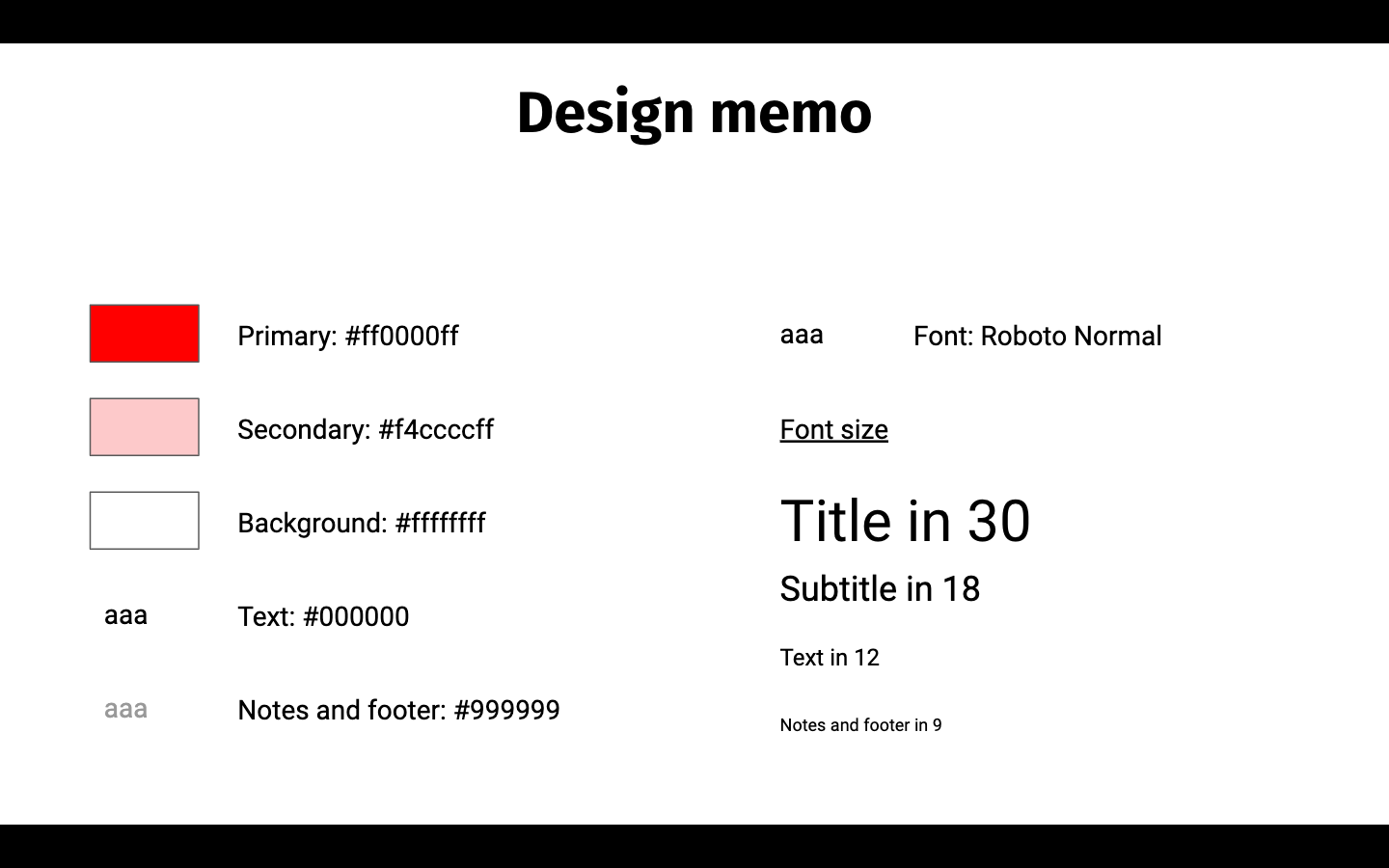
3.2 Define your graphic identity
When it comes to design, consistency is key.
To ensure design consistency, you should define your font types, font sizes and colors and stick to them.
- Pick a font that is readily available across most systems. Go with standard stuff, stay away from fonts that need to be purchased, downloaded, installed. DON'T use Comic Sans MS.
- For a professional feel, pick two fonts - one for headings and one for paragraphs. Don't guess, use FontPair to find good pairs of fonts.
- Stick to 3 to 4 font sizes across the whole deck. A larger font for titles, a medium font for paragraphs, and a smaller font for notes and footers.
- With colors, less is more. I usually go with a primary color (e.g. bright red), a secondary color (e.g. softer version of the same red), and a background color (e.g. plain white). Play around with Adobe Color if you are indecisive.
I like to group all that information on a slide at the end of my deck for reference.
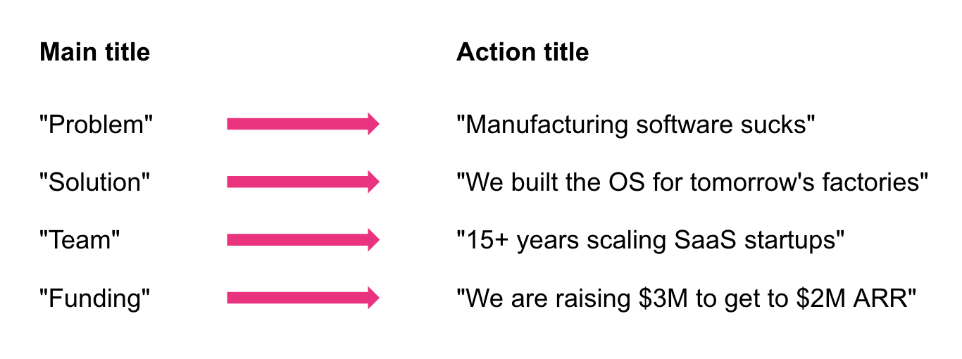
3.3 Use "action titles" for your slides
Most investors don't read the slides. They just read the title.
Therefore, your slide title cannot be "Team" or "Market".
Instead, your slide title should drive the key point of the whole slide in one line. It should be formulated as a full sentence with a subject and a conjugated verb. In consulting gibberish, we call that an "action title".
For example, if you are raising $3M to go to market, the title of your "Funding" slide could be: "We are raising $3M to go to market". It's that simple.
Do that for each slide. Don't waste too much time finding the perfect title: you're gonna iterate a lot anyways.
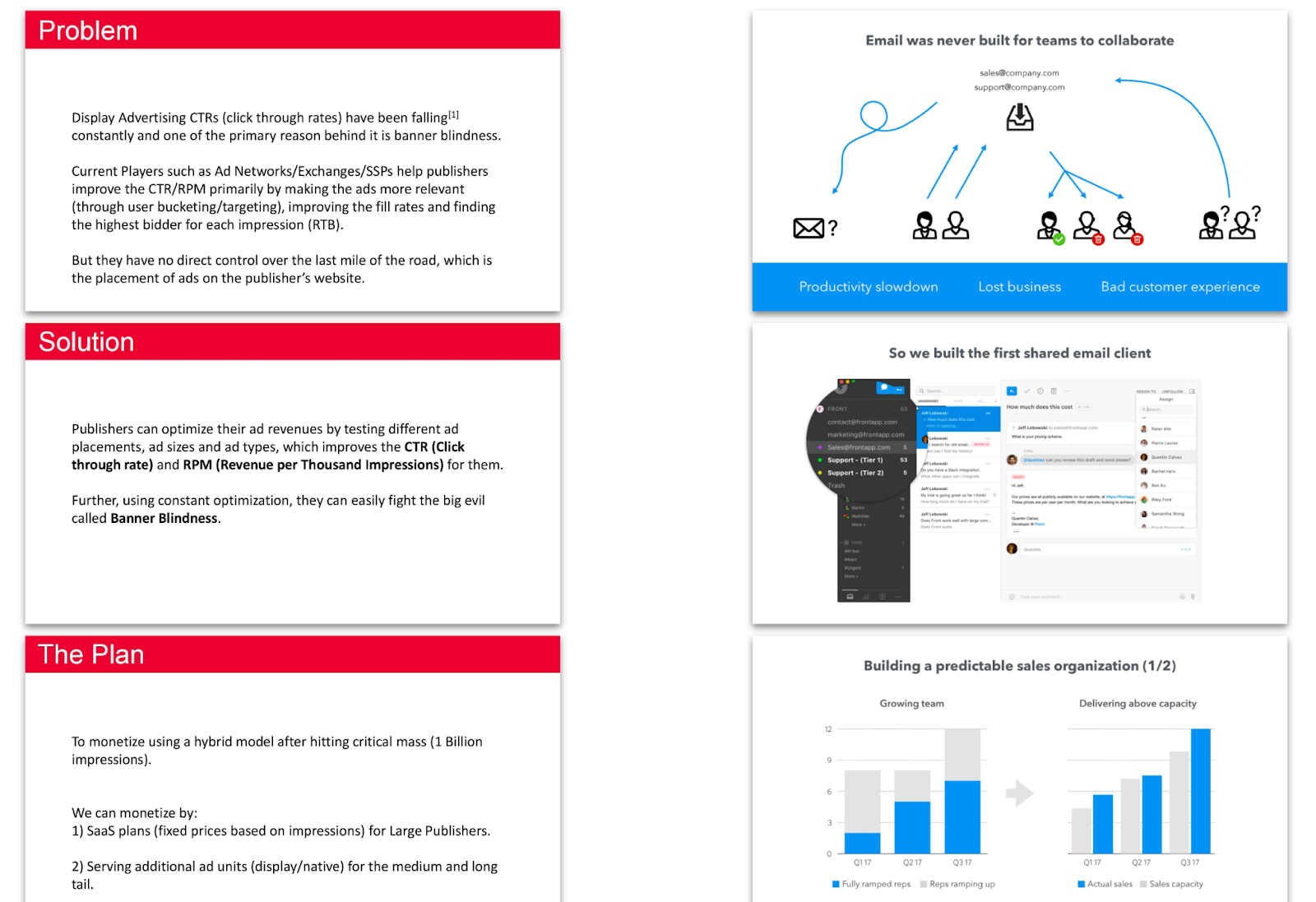
3.4 Don't tell your message, show it
People don't read. So don't write.
Instead, you want to show your message as much as possible.
See the example below. The deck on the left "tells" the problem, the solution, and the plan. The deck on the right shows them.
Which one looks more appealing in your opinion?
3.5 Learn about the Rule of Thirds
Here's the most basic design rule: the Rule of Thirds.
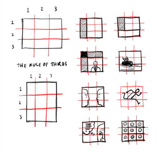
The Rule of Thirds is a simple yet highly effective way to organize information on a slide. You see it all the time in startup pitch decks.
If you're not sure how to design a slide, just go with the rule of thirds.
3.6 Borrow slide design from other decks
Sometimes, the Rule of Thirds is not enough and you get stuck. You want to express an idea, you could write a paragraph about it, but you don't know how to communicate it visually.
That's when you steal inspiration.
I have put together a free directory of 1,600+ slides from famous decks - including Coinbase, Buffer, Airbnb. More importantly, I've categorized them by slide type: Market, Competition, Team, etc. This allows you to build great slides super fast.
Let's say you can't come up with a great layout for your Market slide. Check out the Market slides of other decks, find your favorite, then mercilessly steal it for your own use.
Rinse and repeat as needed :)
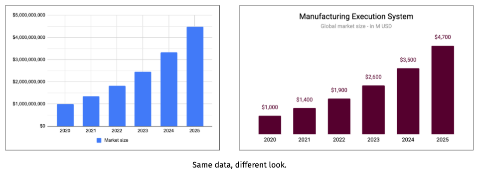
3.7 Build sleek, clean graphs
Chances are, your deck includes bar charts, mekkos, and the obligatory pie chart. Here are a few tricks to make your graphs stand out:
- Do not copy-paste a graph from a report or a market study. It's ugly. Recreate it.
- Always remove gridlines
- Always remove vertical axes and add labels - unless clearly inconvenient
- Round up numbers. Use the function "=round(REF, -n)" to do so.
- Remove legends when redundant (e.g. already in the horizontal axis)
- Use your company's fonts and colors
- Add a title and a subtitle if needed
- Add the source somewhere on the same slide
As a general rule, your graphs should "stand on their own" i.e. they should be understood by anyone who reads your deck without any sort of explanation.
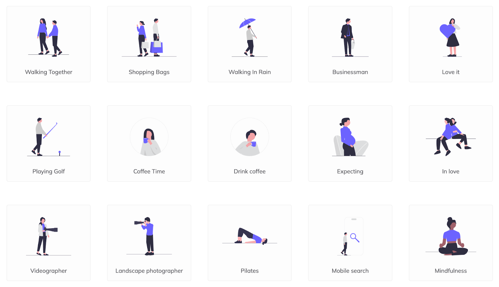
3.8 Use gorgeous illustrations
Whatever you do, please don't use generic, soulless corporate images à la Shutterstock or Getty Image.
Instead, here are my go-to places for free, high-quality illustrations:
3.9 No video, no URLs, no animations
Investors want to be able to read your deck and decide whether they want a call in less than 3 minutes.
Anything that breaks the flow is a disruption. Videos are not opened, URLs are not opened, animations are an absolute pain, especially when you flick back and forth between slides.
Write a plain deck, text and images. That way, you control the experience from start to finish. You want to be sure your deck runs well even if the VC opens it in a busy subway with a weak signal from his smartphone.
Yes, they do that.
3.10 Keep a clean footer
Many founders add a footer with supposedly important information. The most extreme "footer cases" include logo, company name, a "CONFIDENTIAL" mention, date, and slide number.

I don't like it.
Most of it is already on your cover anyways. It serves no real purpose. It's eating up space that could be used to make your charts bigger. It adds clutter. It distracts the reader from your key message.
Only exception - the slide number can be helpful when discussing the deck.
4. Optimize your pitch deck
Once your v1 is ready, it's time to optimize it.
4.1. Check for the 10 critical failures of your pitch deck
If your deck matches any of the 10 following points, it's a critical failure.
- The deck is over 20 slides long or contains low-value slides like "Appendix" or "Table of content".
- The deck design is weak: excessive text density, too small fonts, wrong color palette, poor alignment of objects on the slides, generic stock images, etc.
- Your slides use simple titles e.g. "Traction" instead of action titles e.g. "MRR growing 20% month-over-month"
- The Cover slide doesn't contain a clear, descriptive tagline. The Cover slide contains a date.
- The Problem you're going after is too generic and broad, with no clear target defined.
- The Team slide is missing or lacking key information: founder names, roles in the startup, past achievements.
- There is no product illustration, such as mockup, screenshots, or schematics.
- The Market slide doesn't follow a bottom-up approach. The market size isn't expressed in value (USD, EUR).
- The Ask slide is missing or lacking the round size.
- The last slide (Back cover) doesn't include the email address of the CEO.
Make sure to clear those 10 points before doing anything else!
4.2. Test every slide against investors' expectations
Investors are creatures of habit.
When they open a deck, the first thing they do is scan for signals. Is your TAM above $1bn? Is your MoM MRR growth double-digit? Do you have a complete founding team? Each slide is basically a litmus test against a pre-established framework.
You may not like it, but these are the rules of the game. Therefore, it is your duty as a founder to make sure that each one of your slides meets or exceeds investors' expectations.
Thankfully, investors being creatures of habit makes them highly predictable. Their expectations are always the same. Zero originality. So you can easily learn about them. I wrote a playbook on this, available here. Check it out.
Whatever you do, don't lie. Never lie. Your reputation is worth more than any slide.
4.3. Make sure your mum understand each slide
Clarity means that your message is instantly understood and remembered.
"Normal people", i.e. people who are not into startups, are the best audience to help you dumb down your pitch. If they can understand your message, anybody can.
At slide level: your visuals should speak for your title. Hide the title and ask your mom to guess the general idea of the slide based on the content.
At deck level: ask your mom to read the whole deck. Tell her she has 3 minutes to go through it. Ask her what she remembers from it in a few sentences. You'll be amazed by how simple your message must be in order to get across unscathed.
Repeat with your brother, your best friend, your dog until you get a predictable answer.
4.4. Run your deck through more experienced people
The final "quality check" consists of pitching your deck to professionals who have experience in the startup space.
Fellow entrepreneurs, consultants, incubators and accelerators, mentors… Opportunities abound when it comes to getting a second opinion. Heck, there's even a subreddit where you can post your deck and get roasted.

Having said that, opinions are a dime a dozen. Accept feedback gracefully, then apply discretion. More importantly, get multiple opinions.
4.5. Once you start raising, keep iterating on your deck.
Your deck is not finished when you start meeting investors.
Actually, it's the opposite.
Once you start pitching, you get onto a learning curve that you need to climb as fast as possible. Start by pitching the investors you want the least, then move up your order of preference. Leave your ideal investors last.
After every pitch, make sure to incorporate relevant feedback to your deck. Think about it: an investor is the best pitch deck consultant you can ever find. Make the most of it.
Again, not all feedback is good feedback. Investors are not always right. Use your judgment, filter out noise, retain signal.
4.6. Learn to use versioning
One last piece of advice. If you've got to iterate, you've got to learn to use versioning.
Versioning is a feature commonly found in Google Slides, Powerpoint et alii. As its name indicates, versioning automatically saves and manages older versions of your deck, so you can return to them weeks or even months later. Very convenient if like me, you are prone to second thoughts.
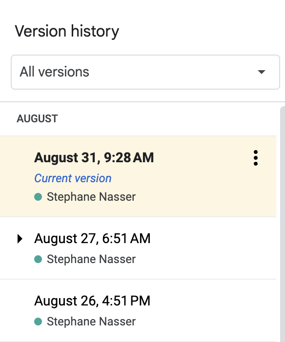
On top of that, I like to manually create copies of my deck every time I make a major change. The older versions go into an "Archive" folder. After 6 months if fundraising, I have reached version 13...
Should I hire a designer for my pitch deck?
If you can afford it, yes.
You may not like it, but a great design makes a difference in how your company is perceived. No matter your metrics, no matter your team, we're visual animals at the end of the day. So it only makes sense to get a design expert to work on your pitch deck.
Here is the list of the best pitch deck designers - with their prices: https://pitchdeckexperts.app/
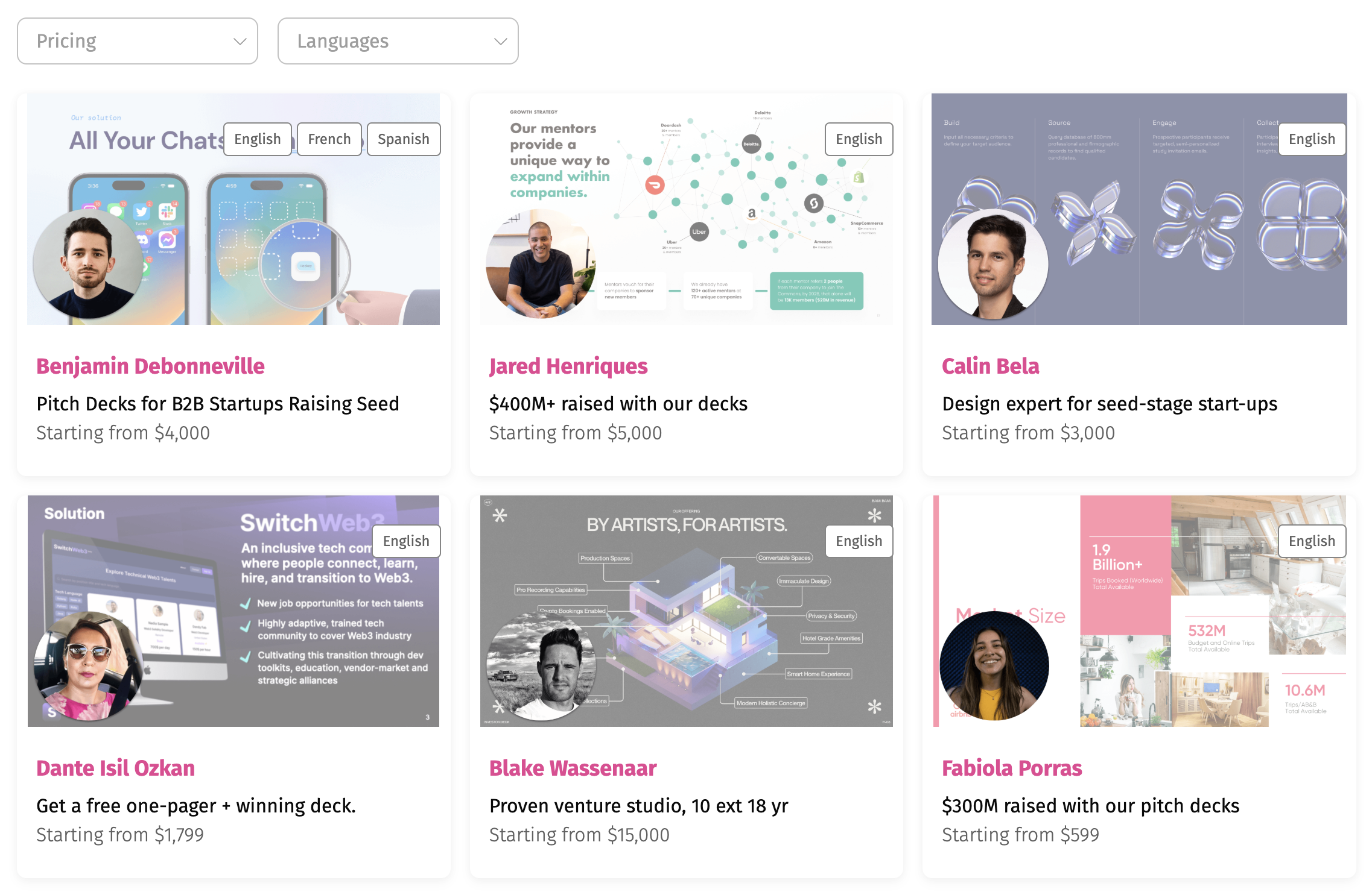
This is all the truer since your pitch deck will lead to a 6 to 8-figure investment. The ROI is incredibly high. It's worth it - provided you can shell out the $1k+ required. Just make sure you hire a great designer, one with strong storytelling skills, business acumen, and multiple verifiable references.
Don't be fooled: the designer won't do all the job for you. You have to get involved if you want to make the most out of the collaboration. Ideally, craft a first version of the pitch deck alone, and use this as a basis for conversation with the designer.
If you cannot afford it, then buy a great template. Still an acceptable option, especially at a very early stage.
Conclusion: a great deck doesn't make a great startup
A deck can convey your vision better, but don't expect a miracle. It won't make your startup better. If the basics are crap, it will show.
You can put lipstick on a pig, but it's still a pig.
So build a great startup first, a great pitch deck second.
Get free, instant pitch deck feedback
Catch the issues investors would reject in seconds — before you hit send.


![12 Best Startup Financial Model Templates [Free & Paid]](https://d1pnnwteuly8z3.cloudfront.net/images/177302d9-3657-45b7-ac9d-acf801d83a74/1b029edf-43cf-4bd9-9e37-203f66bf426f.png)